Become a Master: Basic Art Concepts
Pablo Picasso, one of the most recognized painters in the world, once said: “Learn the rules like a pro, so that you can break them like an artist.” In this article, we will learn about the fundamental concepts of art: elements of art and the principle of design. These concepts will help you become a master painter, especially if you integrate them with your painting. Keep on reading to find out more!

The Elements of Art and the Principles of Design are not only applicable in painting, it can also be applied to different areas of visual arts. These elements are the building blocks of art that helps you create a masterpiece and through the help of the principles of design, it will help you achieve an aesthetically-pleasing artwork. Learn the basics and bend the rules, experiment with the elements and principles, combine them and do whatever pleases you. You’re an artist so your creative expression has no limit.
Moreover, your knowledge of these concepts is very essential and can be used to your advantage--it will teach you how to make your artwork more interesting and unique. With these, you will learn balance, what is contrasting and what is not.
The Elements of Art:
-
Line:
The basic foundation of sketching that can also be applied in painting. By definition, it is a point or mark in space characterized by length, not width. There are different types of lines: horizontal, vertical, diagonal, curved, continuous, broken, jagged, thin, and thick.
-
Color:
It is the chromatic quality of an object and arguably the most used element in art. Color is produced through reflection of the light upon the object. It has three components: hue, value, and intensity. Hue is simply the name we give a color such as “red,” “purple,” and “blue”. Value refers to the lightness or darkness of a color while intensity refers to the vividness or dullness; it can also be referred to as saturation.
-
Shape:
Shapes are two-dimensional geometric or free-form objects that are closed in form, which expresses width and length.
-
Form:
A three-dimensional version of shape that has depth, length, and width. Common examples of forms are cylinders, pyramids, and spheres.
-
Space:
An area that is between and around objects. It can also be referred to as the feeling or illusion of depth. There are two classifications of space: negative space and positive space. Negative space is the area that is through, around, in between, and within objects. On the other hand, positive space is the area being occupied by an object or form.
-
Texture:
It is the textile and surface quality of an object that can either be seen or felt. Usually in art, particularly painting, the way an object looks (rough texture, etc.) may not always be felt in reality. Hence, texture can either be implied or just an illusion.
The Principles of Design:
-
Pattern:
This is the arrangement of certain elements or designs in a piece of art that are recurring in form or in sequence--may it be in color, size repetition, sequence of objects. Not all patterns are obvious, some repeated motifs may appear through interpretation or simply on the way the artwork was created.
-
Balance:
It is the principle of equal visual distribution of the elements of art in a certain artwork. There are three types of balance in art: Symmetrical balance, Asymmetrical balance, and Radial balance. Symmetrical balance is characterized by two equal and identical sides while asymmetrical balance is the opposite. On the other hand, radial balance refers to the balance of all elements upon a central point (circular). The gothic window below shows symmetrical and radial balance at the same time.
-
Proportion:
Proportion is concerned with the size or amount of a certain element or object in the artwork in accord with the rule of thirds and the golden ratio to make your painting visually appealing. Variety in proportion creates another layer of interest in your painting.
-
Emphasis:
The focal point of an artwork--it could be an object, an element, or even another principle of design. For example, in Leonardo da Vinci’s painting “The Last Supper,” we can see that the emphasis is balance, line, and space.
-
Contrast:
Arguably the most important principle of design in arts, contrast can come in many forms. Generally, it is the juxtaposition or difference between the elements and the principles to create visual interest in an artwork.
For example, in this painting of Vincent van Gogh’s “Mountains with Wheatfield in the background,” there is a contrast between the colors and detail-- the colors are contrasting between the hues and color palette, while the detail shows contrast between the style of the brushwork: some areas have thick, strong detailed brushwork while some areas show no texture.
-
Movement:
Your art may not move literally, but certain techniques on brushwork, color choice, and patterns can help in giving your painting an illusion of movement. This image below is Claude Monet’s painting called “Three Fishing Boats,” an illusion of movement was made possible by the powerful and textured brush strokes and combination of color on the ocean.
-
Variety:
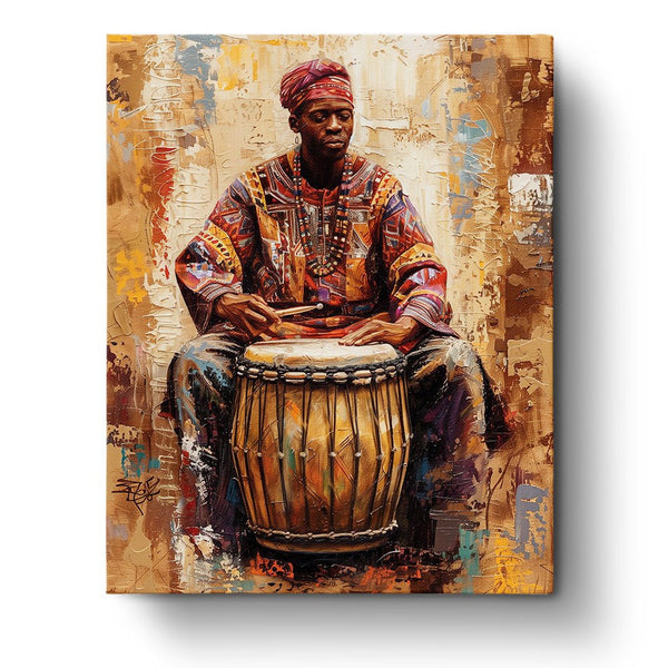
Somehow similar to pattern, variety is the diversity of visual elements on an artwork. It is characterized by the use of different elements and principles of design to create a variation or repetition that is still visually appealing. This painting, for example, shows a variety in colors, pattern, and application of techniques.
-
Harmony and Unity:
Harmony and Unity shows the visual coherence of an artwork as a composition in order for it to make sense as a whole artwork in general. These principles show how well the visual elements and principles work together as a whole. Thus, it is concerned on whether or not the elements and principles used make sense in the final outcome of the artwork.
-
Scale:
Scale and proportion are two different principles. While proportion is concerned with the size of a certain object or element, scale is concerned with the size of an object in comparison to its surroundings.

Key Insights
Learning the Elements of Art as well as the Principles of Design is very important especially as a beginner artist. These concepts are applicable in almost every area of art, not just in visual arts. Use this knowledge to your own advantage in order to make a visually appealing and very meaningful work of art.


