How to Choose the best Paint By Number Photo

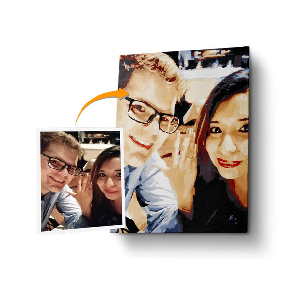
The adage “a picture is worth a thousand words” is more than a string of pretty words; it’s a statement that rings true since time began. What has this got to do with picking a photo for a customized paint by number kit, you ask? It’s simple: select the wrong picture and boy oh boy will you have more than a thousand words to say about your custom kit!
Does it sound dramatic? It won’t be once a user error is encountered. For example, if you picked a photo that has too many details, such as fine hair/fur, you’ll be overwhelmed by the sheer amount of work you have to complete. (We wouldn’t be surprised if you started pulling out your own hair!)
When it comes to picking the best photo, there are three things that you must take note of image composition, brightness and contrast, and color and saturation.
IMAGE COMPOSITION AND SIZE
Have you heard of that old saying “center of attention,” right? Being the center of attention is not always a good thing for two reasons. One, the subject in the center will take away the details you have in the background, and two, it makes a bland photo as it doesn’t have any dynamic movement.
If you have photography-savvy friends, you probably have heard them mention the term “rule of thirds.” This video shortly explains what it is and how it can apply to almost pet, person, place, portrait, or picture! Rule of thirds is an excellent method to make a static picture move with the power of a simple camera trick. Here are a couple of samples.
 It would be best to have subject-focused images, well, focus on the subject. The cyan-colored lines are digital rulers used to help center the image.

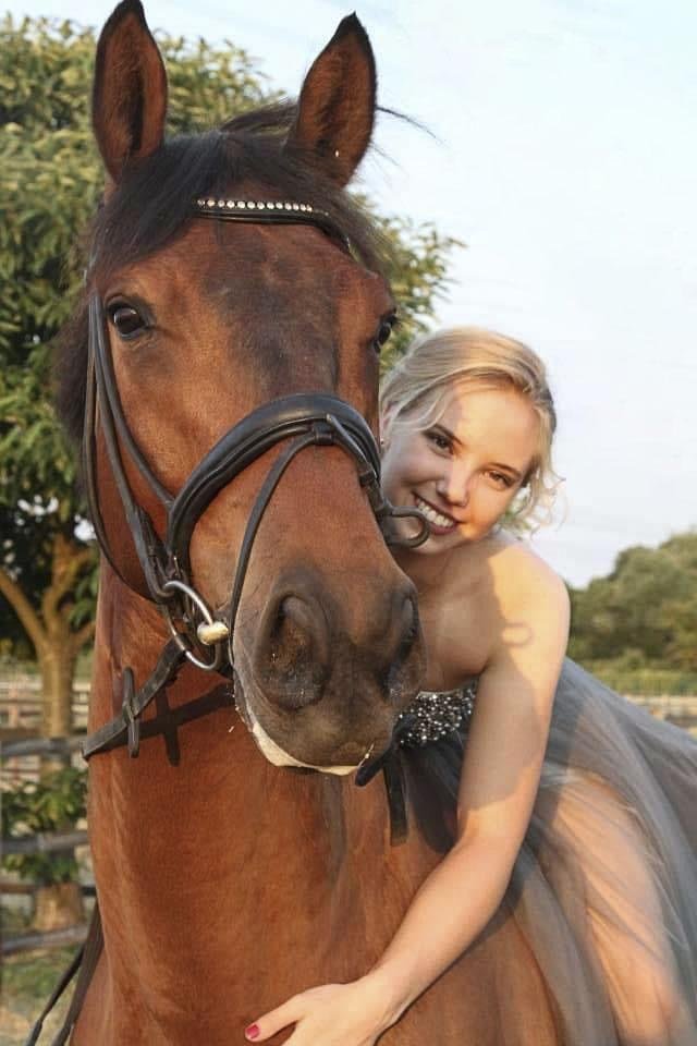
This photo is a perfect rule of thirds sample. It’s a still image, but the composition gives it a particularly dynamic flow or movement.
But that’s not all, folks! Image size is also essential as the image contents. The majority of the custom kits sold are set 40 by 50 centimeters (16 by 20 inches). It is crucial to pick a photo with at least a 4:5 ratio if you don’t want any part cut-off. Below is a picture that demonstrates the importance of the image’s size.

BRIGHTNESS AND CONTRAST
Brightness talks about the general lightness or darkness of the image where are contrast refers to the difference in brightness between objects or regions. Here are a few examples.

The sudden pop of yellow in lush greenery is a good contrast. This image also follows the rule of thirds.
To bring up an example which is so beautiful but would be to dark for painting is this one:


